Bottom App Bar with Menu and Swipeable Tabs in Flutter
The recent revamp of the Material Design has introduced new beautiful items, for example, the Bottom App Bar.
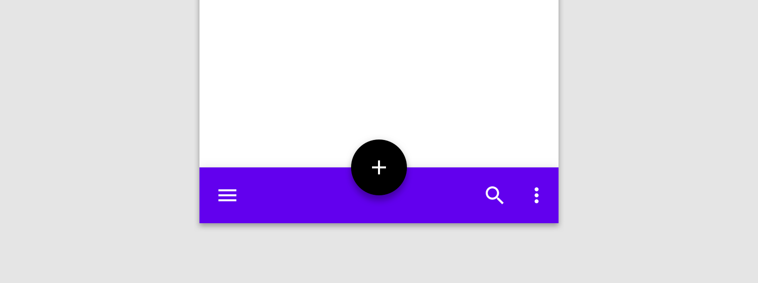
Image from Material Design Guidelines
With Flutter is super easy to implement like shown in the official documentation. However, for me, the tricky part is to combine it with swipeable tabs so, in this article, I’ll explain all the steps that I’ve followed to obtain it.
Here’s a spoiler of the final result:
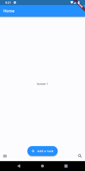
So (another spoiler), we have to mix together three elements: a BottomAppBar, a BottomSheet, and a TabBarView.
First of all, the first step is to create a Placeholder widget that will be shown in the different tabs in which simply shows a text in the center. Of course, this widget should be replaced with the specific implementation.
import 'package:flutter/material.dart';

class PlaceholderWidget extends StatelessWidget {
    final String text;

    PlaceholderWidget(this.text);

    @override
    Widget build(BuildContext context) {
        return Center(child: Text(text));
    }
}
Now, its time to create the structure in which the Placeholder widgets will be shown by using a Scaffold widget. In this case, the Scaffold Widget has three main children: a FloatingActionButton, a TabBarView and a BottomAppBar.
Let’s start with the TabBarView. Usually, the TabBarView is combined with the TabBar that creates an alternative to the swipe to change tab ( You can find an example in the official Flutter doc). However, in this case, the alternative is provided by the menu callable from the BottomAppBar as shown in the GIF above.
TabBarView(
    controller: _controller,
    children: _allPages.map<Widget>((_Page page) {
    return SafeArea(
            top: false,
            bottom: false,
            child: Container(
            key: ObjectKey(page.widget),
            padding: const EdgeInsets.all(12.0),
            child: page.widget
        ),
    );
}).toList()
As you can see, it is a very simple snippet that returns as children (i.e. the different tabs) the widgets contained in the variable _allPages. These widgets are all of the type PlaceholderWidget. In addition to the children, we have to provide a controller, that is the “guy” that keeps the selected tab and content sections in sync. In this case, we don’t use the DefaultTabController , but we create a TabController to handle the tabs also from the menu. If the swipe is enough to change tabs, we could simply use the DefaultTabController.
_controller = TabController(vsync: this, length: _allPages.length);
Now, let’s focus on the BottomAppBar.
bottomNavigationBar: BottomAppBar(
    child: new Row(
        mainAxisSize: MainAxisSize.max,
        mainAxisAlignment: MainAxisAlignment.spaceBetween,
        children: <Widget>[
            IconButton(
                icon: Icon(Icons.menu),
                onPressed: () {
                _showModal();
                }),
            IconButton(
                icon: Icon(Icons.search),
            )
        ],
    ),
)
As Bottom Bar, we simply show a row with two icons at the edges. This can be done by setting the mainAxisSize and the mainAxisAlignment respectively to MainAxisSize.max and MainAxisAlignment.spaceBetween . One of these two icons is our menu. By clicking it, we will show a Bottom Sheet that shows the list of tabs.
void _showModal() {
    showModalBottomSheet<void>(
        context: context,
        builder: (BuildContext context) {
            return new Column(
                mainAxisSize: MainAxisSize.min,
                children: <Widget>[
                    new ListTile(
                        leading: new Icon(Icons.music_note),
                        title: new Text('Screen 1'),
                        onTap: () {
                            _controller.animateTo(0);
                            Navigator.pop(context);
                        },
                    ),
                    new ListTile(
                        leading: new Icon(Icons.photo_album),
                        title: new Text('Screen 2'),
                        onTap: () {
                            _controller.animateTo(1);
                            Navigator.pop(context);
                        },
                    ),
                    new ListTile(
                        leading: new Icon(Icons.videocam),
                        title: new Text('Screen 3'),
                        onTap: () {
                            _controller.animateTo(2);
                            Navigator.pop(context);
                        },
                    ),
                ],
            );
        }
    );
}
In order to create and show a Bottom Sheet we need to call the showModalBottomSheet<void> method and provide in the builder, the widgets that we want to show. In this case, we use a Column with ListTile widgets, i.e. a widget that can have a leading and a trailing icon and some text.
To navigate to the different tabs, we have to use the TabController defined above and call the method animateTo, by passing as parameter the number of tab that we want to show. After showing the tab we need to close the Bottom Sheet and to do that we can use Navigator.pop(context) that navigates to the first route. You can found more info about the Navigator in the official doc.
Finally, we have to place the FloatingActionButton.
floatingActionButton: FloatingActionButton.extended(
    elevation: 4.0,
    icon: const Icon(Icons.add),
    label: const Text('Add a task'),
    onPressed: () {},
),
floatingActionButtonLocation: FloatingActionButtonLocation.centerDocked,
As you can see, the code is very simple. In this case we want a centered FAB, so we need to specify it in the floatingActionButtonLocation .
And that’s it! With little effort, we have created a very beautiful and modern UI.
Of course, you can find the complete code on my Github.